- HOME
- Work culture
- Types of diagrams in business: A complete guide
Types of diagrams in business: A complete guide
- Last Updated : April 6, 2026
- 49 Views
- 11 Min Read

Imagine opening a toolbox for the first time.
At a glance, everything inside might look similar: metal, functional, and built to fix things. But a hammer won’t help you tighten a screw, and a screwdriver won’t cut through wood. Each tool is designed for a specific problem, and using the wrong one only makes the job harder.
Visual thinking works the same way.
Not all diagrams are built for the same purpose. Some help you map decisions, while others help you explore ideas, design systems, or understand relationships. They may look similar on the surface, but each one solves a different kind of problem.
Here’s a simple guide to 15 diagrams you’ll actually use at work, when to use them, and what they help you do.
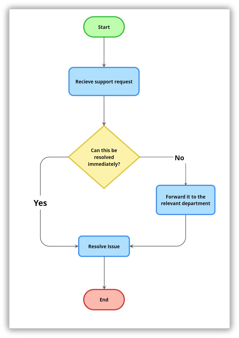
1. Flowchart
A flowchart maps out a process from start to finish, step by step. It uses a set of standard shapes to represent different parts of the process: rectangles for actions, diamonds for decision points, and ovals for where the process begins and ends. Arrows connect everything together and show the direction the process moves in.
Use it when you want to:
Break down how something works
Walk someone through a workflow
Spot where things are slowing down
It’s especially helpful when decisions affect the path (yes/no flows).
A customer support team might use a flowchart to map out how complaints are handled. The process starts when a complaint comes in, then moves to a decision point asking whether it can be resolved right away. If yes, the agent handles it directly. If no, it gets escalated to a specialist.
2. Mind map
A mind map is a free-form diagram that starts with a central idea and expands outward through branches of related concepts, themes, and details. There are no fixed rules about structure or direction. The branches grow naturally as ideas connect, and new ones can be added at any point. This openness is what sets mind maps apart from most other diagram types and makes them well-suited to exploration rather than documentation.
Use it when:
Brainstorming
Planning projects
Exploring complex topics
Mind maps work best at the start of something: a new project, a new topic, or a problem that needs thinking through from multiple angles.
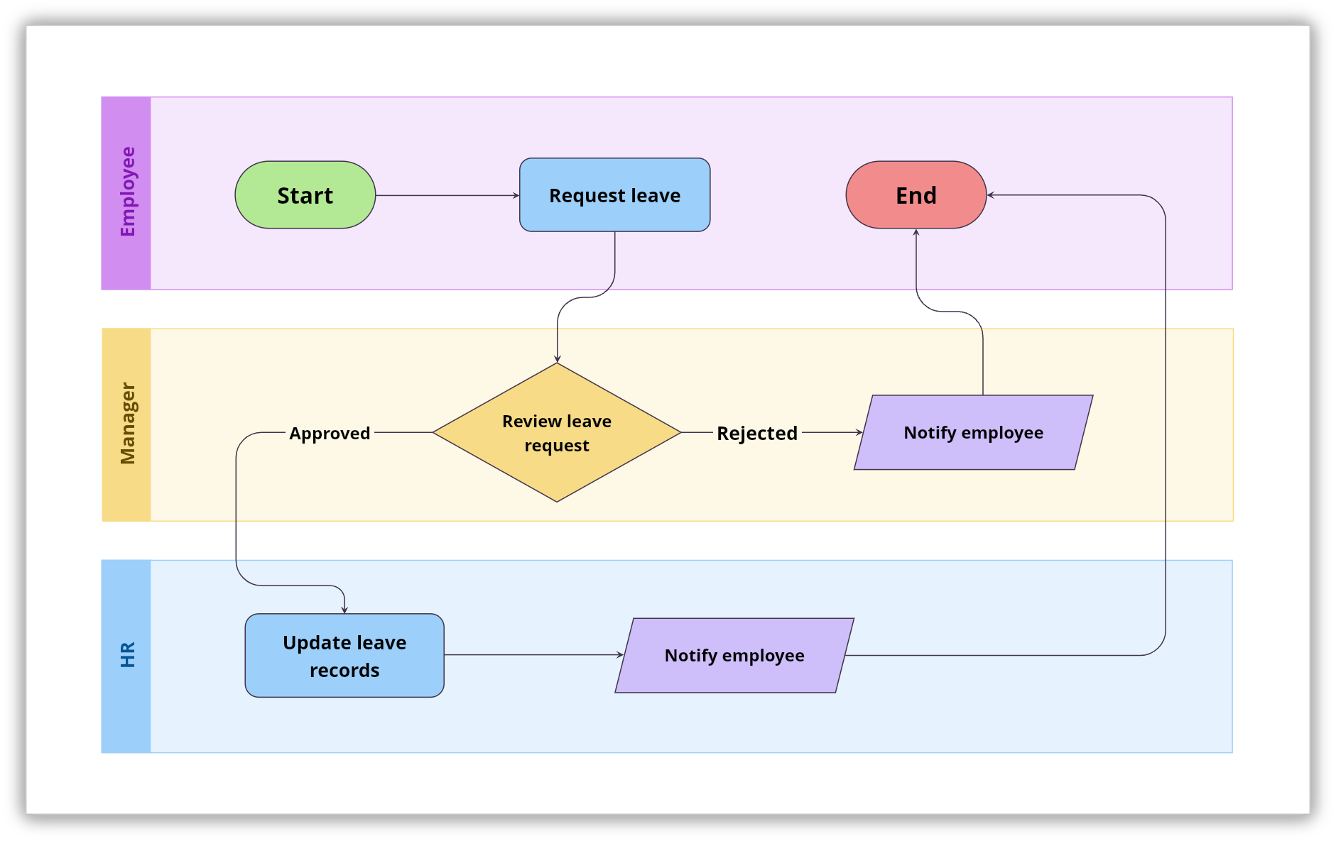
3. Swimlane diagram
A swimlane diagram takes a regular flowchart and adds a layer of structure by dividing it into lanes. Each lane belongs to a specific person, team, or department, and the steps that happen in that lane are their responsibility. The process still flows in sequence, but now you can see at a glance who owns each step and where one team hands off to another.
Use it when:
Work moves across teams
Ownership is unclear
Delays happen between steps
A leave approval process is a good example of this. The diagram has three lanes: employee, manager, and HR. The employee requests leave, the manager reviews it, and, if approved, HR updates records and informs the employee. If rejected, the manager notifies the employee.
4. Data flow diagram
A data flow diagram, or DFD, shows how data moves through a system. It does not focus on the steps people take or the order tasks happen in. Instead, it follows the information: where it comes from, how the system processes it, where it gets stored, and where it ends up. DFDs use four building blocks: external entities that send or receive data, processes that transform it, data stores that hold it, and arrows that show which direction it flows.
Use it when:
Setting up networks
Troubleshooting issues
Reviewing security risks
Think about an online order system. A data flow diagram would show the customer sending order information into the system, the system processing it, a check against inventory records, a confirmation going back to the customer, and payment details being passed to a payment gateway.
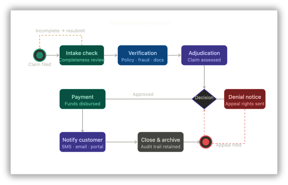
5. BPMN diagram
BPMN stands for Business Process Model and Notation. It is the formal, standardized way to document business processes, and, unlike a regular flowchart that can be drawn however someone likes, BPMN follows a specific set of symbols and rules that are recognized across industries and borders. A business analyst in one country can hand a BPMN diagram to a developer in another, and both will read it the same way.
Use it when:
Processes are complex
You’re building or automating workflows
You need precise documentation
It’s common in enterprise environments where small gaps can lead to big issues.
Take an insurance claim process, for example. What seems simple on the surface—a customer files a claim and a decision gets made—becomes much more complex when you factor in parallel verification checks, automated notifications, edge cases, and regulatory requirements.
6. Network diagram
A network diagram (commonly used by IT, engineering, and infrastructure teams) shows the structure of a network by mapping out all the devices, systems, or nodes within it and how they connect to each other. Each node represents a component such as a computer, server, router, or application, and the lines between them show the connections and relationships. The result is a complete picture of a network's infrastructure in one place.
Use it when:
Setting up networks
Troubleshooting issues
Reviewing security risks
A company moving to a hybrid cloud setup might use a network diagram to show how on-premise servers connect to cloud services, how firewalls and load balancers sit between them, and how end-user devices access different parts of the infrastructure.
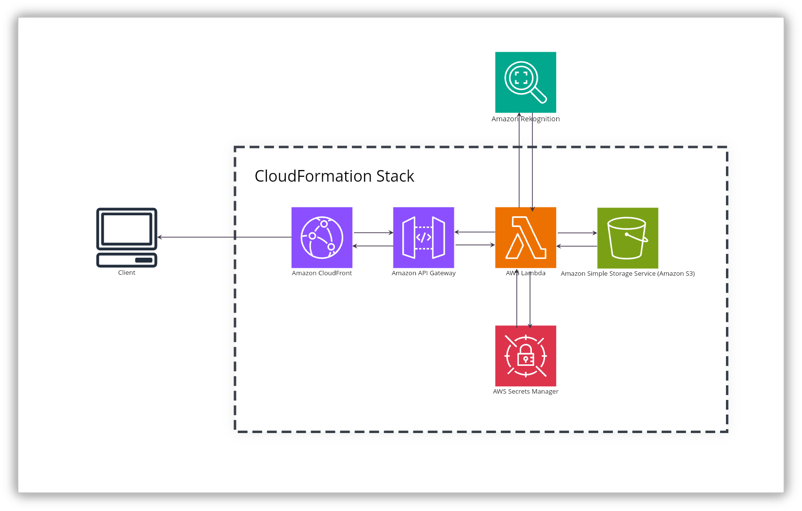
7. Architecture diagram
An architecture diagram shows how the components of a system are designed and how they work together. Where a network diagram focuses on connections between devices, an architecture diagram zooms into the design itself: which services exist, how applications talk to each other, where databases fit in, and how integrations are structured. It is a high-level blueprint that captures the thinking behind a system, not just its physical layout.
Use it when:
Planning new systems or features
Explaining technical decisions
Aligning teams before development
It acts like a blueprint everyone can refer to.
Engineering teams, solutions architects, and technical leads use architecture diagrams when designing new systems, documenting existing ones, or walking stakeholders through technical decisions.
8. UML diagram
UML stands for Unified Modeling Language. It's not a single diagram but a whole family of diagram types, each designed to model a different aspect of a software system. Class diagrams show the structure of the code. Sequence diagrams show how different parts of the system interact over time. Use case diagrams show what the system does from a user's perspective. Each type answers a different question about the system being built or documented.
Use it when:
Designing software
Documenting systems
Communicating technical ideas clearly
UML diagrams are the shared language of software engineering. Developers, architects, and analysts use them to communicate technical designs in a way that is precise and consistent, regardless of the programming language or platform involved.
9. Entity relationship diagram (ERD)
An entity relationship diagram, or ERD, is a visual representation of the data within a system and the relationships between different pieces of that data. It identifies entities such as customers, products, or orders—along with their attributes—and shows how they relate to each other. It also captures the nature of those relationships, like whether one customer can have many orders or whether each appointment belongs to exactly one patient.
Use it when:
Designing databases
Structuring data
Understanding relationships between data points
A healthcare application managing patients, doctors, and appointments would use an ERD to show that one patient can have many appointments, each appointment is linked to one doctor, and one doctor can be assigned to many patients.
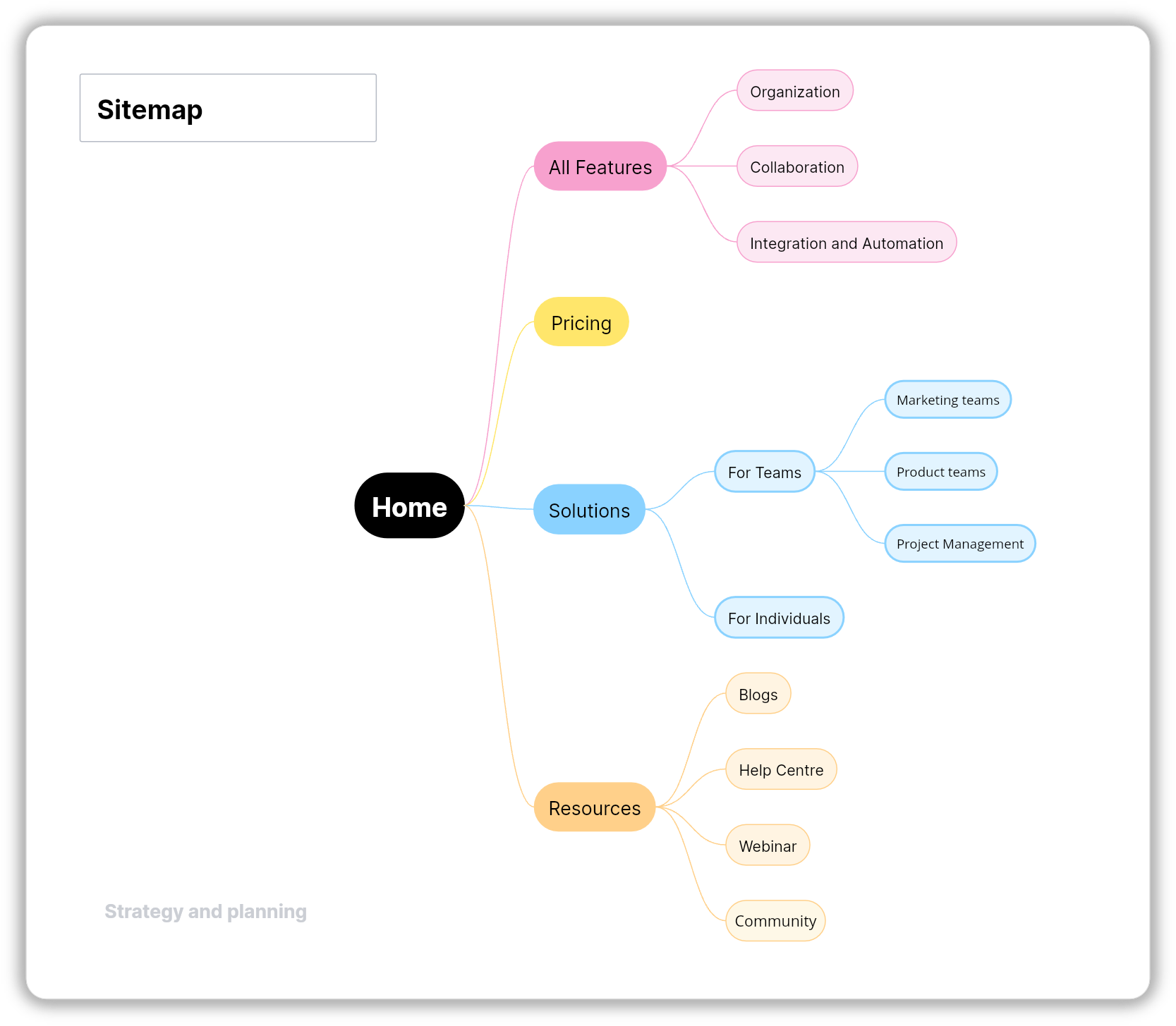
10. Sitemap
A sitemap is a tree-style diagram that shows the structure of a website or digital product. It lays out how pages are organized, how they connect to each other, and what sits at each level of the navigation hierarchy. Think of it as the architectural plan for a website, giving teams a clear view of every section, page, and path before anything is designed or built.
Use it when:
Planning websites or apps
Organizing content
Improving navigation
UX designers, content strategists, product teams, and developers use sitemaps during the planning phase of a website or app project. Sitemaps are also directly relevant to SEO, since a well-structured site makes it easier for search engines to crawl and index the content.
11. Journey map
A journey map tells the story of a customer's experience from their point of view. It follows them through every stage of their interaction with a product, service, or brand, capturing what they're doing at each point, what they're thinking, and how they're feeling.
Use it when:
Improving user journeys
Identifying friction points
Understanding behavior
The goal is to make the customer's experience visible to the whole team so that decisions are made with a real understanding of how people actually experience what the business provides.
12. Service blueprint
A service blueprint extends the journey map by revealing what's happening behind the scenes at each stage of the customer experience. It shows the customer's actions in one layer and, directly below it, the staff actions, internal processes, and supporting systems that make each customer moment possible. Both sides of the experience—the part the customer sees and the part they don't—are visible at the same time.
Use it when:
Fixing service issues
Aligning operations with experience
Finding root causes
They are especially valuable in service design, operations, and any situation where a customer problem is being caused by something happening internally. A service blueprint makes it possible to trace customer frustration back to its operational root, which is often not where you expect it to be.
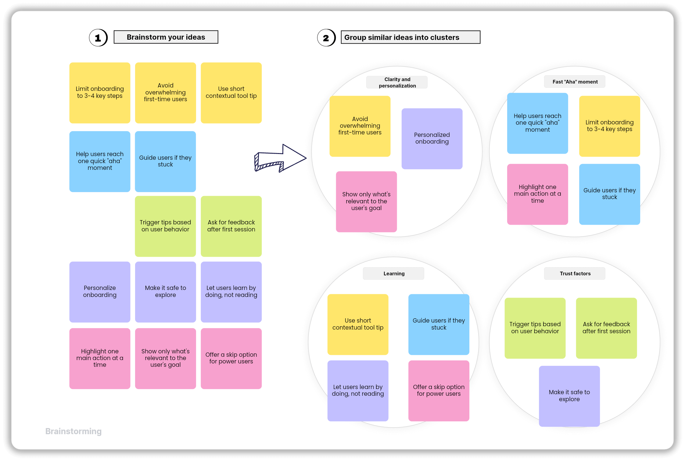
13. Affinity diagram
An affinity diagram is a way of making sense of a large amount of information by sorting it into groups based on natural relationships. It usually starts with a collection of individual items, often written on sticky notes during a research session or brainstorm, which are then moved around and clustered together based on what they have in common. Each cluster gets a label that captures the theme running through it.
Use it when:
You’ve gathered lots of data
You need patterns to emerge
You want clarity after brainstorming
They're common in UX research, product discovery, and retrospectives. When a team walks out of twenty user interviews with pages of notes, an affinity diagram helps turn that raw material into something actionable by surfacing the themes and patterns that show up most often.
14. Venn diagram
A Venn diagram uses overlapping circles to show the relationship between two or more groups. Each circle represents a set of things, and the area where the circles overlap shows what those sets have in common. What belongs only to one group sits in the non-overlapping part of its circle, and what is shared sits in the middle.
Use it when:
Comparing ideas
Finding common ground
Making decisions
In business, strategy teams use them for competitive analysis, UX teams use them to map overlapping user needs, and product teams use them to figure out where their offering fits relative to what customers actually want.
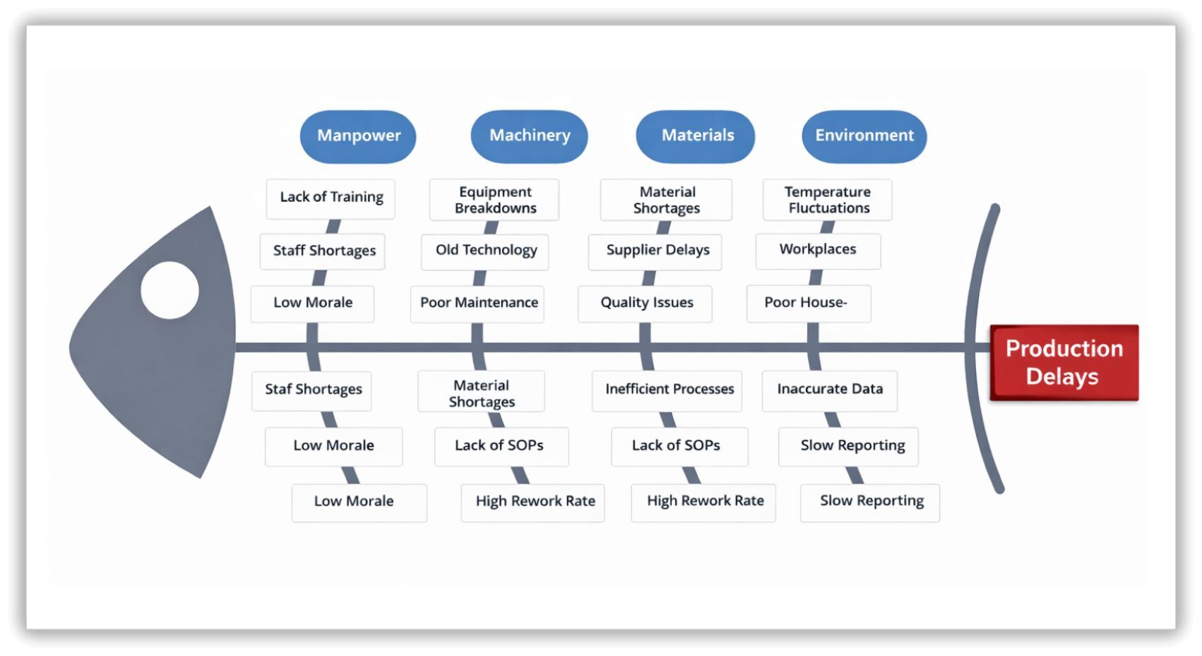
15. Fishbone diagram
A fishbone diagram, also called an Ishikawa diagram or a cause-and-effect diagram, is a structured way to investigate why a problem is happening. The problem sits at the head of the diagram, and, from a central spine, the main categories of possible causes branch off like the bones of a fish. Within each category, more specific causes branch off further, building a detailed map of everything that might be contributing to the issue.
Use it when:
Problems keep repeating
You need deeper analysis
You want structured thinking
They encourage teams to think across multiple categories at once, which helps avoid the common trap of jumping to the most obvious cause and missing the real one. Categories typically include people, processes, tools, environment, and materials, though these are adjusted to fit whatever situation the team is investigating.
Final thoughts
There is something reassuring about the right diagram. When the visual matches what you're trying to explain, the conversation shifts. People stop squinting at the screen and start talking about the actual problem. Ideas that were stuck in someone's head become something the whole team can see and work with.
Each of the fifteen diagrams in this guide does what the others cannot. That's not a limitation—it's the point. The more clearly you understand what each type is built for, the faster you'll reach for the right one. And when you do, the work tends to get a little easier for everyone.
Also read
Diagramming 101: How teams use diagrams to think, plan, and collaborate
The best collaboration tools for startups in 2026: A complete guide